Book now 213-479-8672
L o s A n g e l e s
Best Colors To Wear For Professional Headshots
6/13/20266 min read
The wrong shirt color can make an expensive headshot look flat, dated, or distracting in seconds. The best colors for professional headshots are the ones that keep attention on your face, support your skin tone, and match the kind of work you want to book. If your photo needs to work for casting, LinkedIn, personal branding, or agency submissions, color choice is not a small detail. It is part of the strategy.
A strong headshot is supposed to help you look current, confident, and easy to remember. That means your wardrobe should do one job well - frame your face without competing with it. The best color for one person is not always the best for another, but there are clear rules that make choosing a lot easier.
Best colors for professional headshots start with contrast
The fastest way to choose a strong headshot color is to look at contrast. If you wear something too close to your skin tone, your image can feel washed out. If you wear something too intense for your features, the shirt shows up before you do.
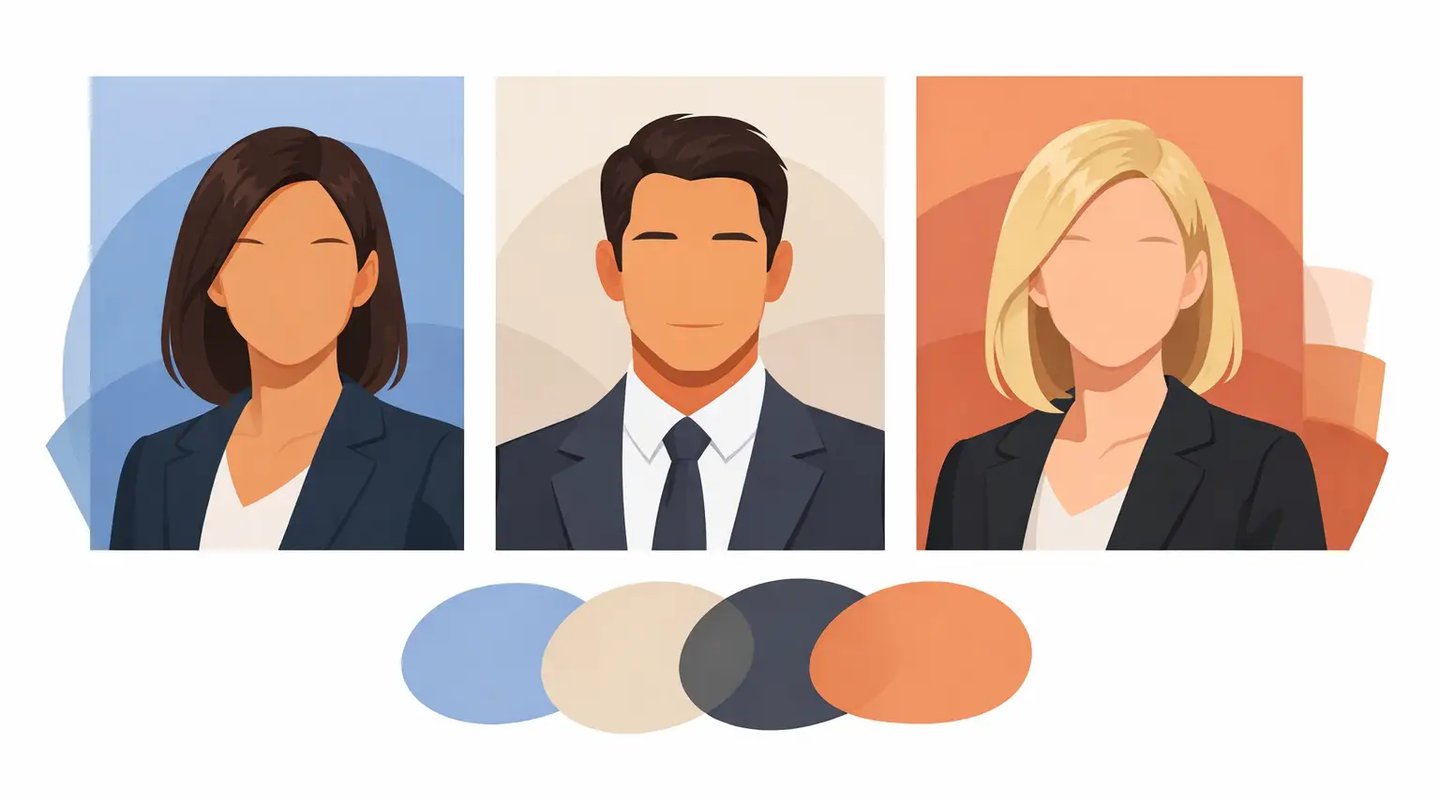
Most people photograph best in colors that create clean separation from their skin, hair, and background. That usually means medium to deep tones rather than very pale shades. Navy, charcoal, deep green, burgundy, and rich blue tend to perform well because they add structure without stealing focus. These colors read as polished, reliable, and camera-friendly across a wide range of industries.
For actors and performers, contrast matters even more because your headshot often appears as a small thumbnail before anyone clicks it. A color that defines your face clearly can help your image stand out on casting platforms. For business professionals, the same principle applies on LinkedIn and company directories. Clear, flattering contrast makes you look more put together right away.
The safest high-performing colors
If you want a short answer, start with jewel tones and grounded neutrals. They are dependable because they photograph consistently and suit most people better than trendy shades.
Navy is one of the strongest options for almost everyone. It reads professional without feeling stiff, and it works for both corporate and creative markets. Dark teal and forest green are also excellent because they bring color into the image while still looking refined. Burgundy adds warmth and confidence, especially for people whose skin tones respond well to richer reds. Charcoal and soft black can look sharp too, though black needs a little care depending on lighting and background.
Crisp white can work, but it is less universally easy than people think. In some setups, bright white can pull attention away from the face or create too much contrast, especially under strong studio lighting. It can still be effective for commercial looks, medical professionals, or clean corporate branding, but it has to be styled carefully.
Soft earth tones can also work beautifully when they are saturated enough. Think olive, rust, muted terracotta, or warm brown rather than beige so pale it disappears on camera.
Colors that usually cause problems
Some colors fail because they are too loud. Others fail because they make your skin look tired.
Neon shades are almost always a miss for professional headshots. They reflect odd color onto the skin and can make the image feel cheap or dated. Extremely bright red can be tricky for the same reason. It can dominate the frame and shift the tone of the image away from professional and toward distracting.
Very pale pastel colors can be flattering in person but weak on camera, especially against light backgrounds. Baby pink, pale yellow, and light lavender often lose impact unless the styling and lighting are very intentional. Beige is another common problem. It may sound neutral, but if it is too close to your skin tone, it can flatten the whole image.
Busy patterns are not technically colors, but they belong in this conversation. Stripes, tiny prints, logos, and high-contrast patterns make the eye work harder. For a career-driven headshot, simplicity wins.
How skin tone changes the answer
There is no universal perfect color because skin undertones shift everything. The best colors for professional headshots should make your skin look clear and alive, not dull or overpowered.
If your skin has warmer undertones, rich earthy shades and warmer jewel tones often look strong. Olive, rust, camel, deep coral, burgundy, and warm navy can all be effective. If your skin has cooler undertones, try cooler blues, emerald, plum, charcoal, and true red toned down into deeper shades.
If you are not sure about undertones, do not overcomplicate it. Hold a few tops near your face in window light and take quick phone photos. The right color usually makes your eyes look brighter and your skin more even. The wrong one can bring out redness, shadows, or sallowness.
Hair color matters too. Someone with dark hair may look great in lighter medium tones because there is already natural contrast in the frame. Someone with very light hair might benefit from deeper wardrobe colors to create more definition.
Best colors for professional headshots by goal
What you wear should support the job your headshot needs to do. A casting headshot, a corporate headshot, and a personal brand image may all call for slightly different color choices.
For actors and performers
Stick with colors that feel current, flattering, and believable for your casting type. Deep blues, olive, burgundy, gray, and muted earth tones tend to work well because they look grounded and help your expression lead. If you are going for a bright commercial look, lighter blues, soft white, or fresh but not flashy tones can work. The goal is still the same - your face first, wardrobe second.
For corporate and LinkedIn headshots
Professional usually means controlled, clean, and credible. Navy, charcoal, white, deep blue, and muted green are reliable choices. These colors communicate competence without feeling severe. If your industry is conservative, lean toward classic neutrals. If you work in a more modern or creative field, you can bring in a little more personality with teal, aubergine, or a richer blue.
For personal branding and creative entrepreneurs
This is where color can carry more personality, but it still needs discipline. Choose one strong color that aligns with your brand and flatters your face. If your brand is energetic and approachable, a vivid but controlled shade like cobalt or emerald can work well. If your brand is premium and editorial, black, cream, camel, or deep monochrome tones may be stronger.
Should you wear black?
Sometimes yes, sometimes no.
Black can look sleek, expensive, and confident. It is especially useful when you want a clean, minimal look or when your brand leans polished and direct. But black can also feel heavy, close off detail, or create too much visual weight if the background is dark or the lighting is low contrast.
For performers, black is often better as one look among several, not the only option. For corporate use, it can work well when paired with strong lighting and simple styling. If black makes your skin look harsh in a mirror or phone photo, switch to charcoal or navy. You usually get the same professionalism with a softer result.
What about white, gray, and blue?
These three are common for a reason, but each works differently.
White looks clean and modern, especially for commercial actors and professionals who want a crisp image. The trade-off is that it can blow out highlights or feel too stark if not photographed carefully.
Gray is flexible and understated. Medium gray is especially useful because it gives shape without demanding attention. It is a great fallback when you want something safe that still looks intentional.
Blue is probably the most versatile family overall. Light blue can feel open and approachable. Navy feels credible and strong. Teal adds a little edge while staying professional. If you only bring one option to a session, a well-fitting blue top is usually a smart bet.
Fit and fabric matter as much as color
A great color cannot save a bad fit. If your shirt pulls, wrinkles, gaps, or hangs awkwardly, the image loses polish fast. The best headshot clothing fits close to the body without looking tight and holds its shape on camera.
Fabric also affects how color reads. Matte fabrics are usually safer than shiny ones because they photograph more evenly. Texture can be helpful when it is subtle. A little structure in knitwear, cotton, or layered fabrics gives the image depth. Too much sheen or too much detail can start competing with your face.
Before your session, try on your options under natural light and take a few test photos. What looks strong in the closet may not look strong on camera. This quick check saves time and helps you show up ready with wardrobe that actually works.
How many colors should you bring?
If your session includes multiple looks, bring variety without bringing chaos. A good mix usually includes one safe professional option, one slightly more expressive option, and one backup that photographs differently from the others. That could mean navy, burgundy, and soft gray rather than three shades of almost-black.
This is especially useful if your images need to serve different goals. One top might be right for LinkedIn, another for casting, and another for website branding. Smart color choices give you more usable images from the same session.
At Headshots by Wick, that kind of planning matters because the point is not just getting a good-looking photo. It is getting images that can start working for you right away.
A strong headshot should look like someone worth calling back. Choose colors that support your face, your market, and your next move, and your photos will do a lot more than just look nice.